
The View-As-Colour tool allows you to see at a glance the values of any of the parameters for a majority of the object types. This is a very powerful tool for model checking. Here are some examples.
Heights
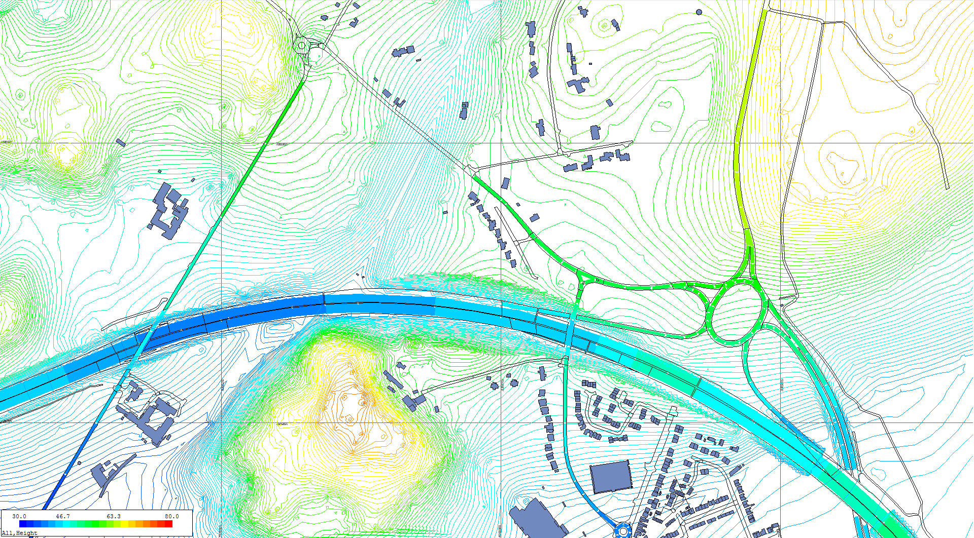
This provides an overview of the topography of an area. This can be used to check very easily whether the height data imported or entered is correct. It will also show any dramatic differences in heights of neighbouring objects, which can indicate errors.
Road Heights
One of the ways this can be used is to show what is happening with the road heights at split level junctions. In the diagram above, it can be seen that a side road which crosses the main road is the same colour as the main road, showing that they are at the same height, rather than one road being above the other. This makes the problem easy to identify.
Traffic Flows
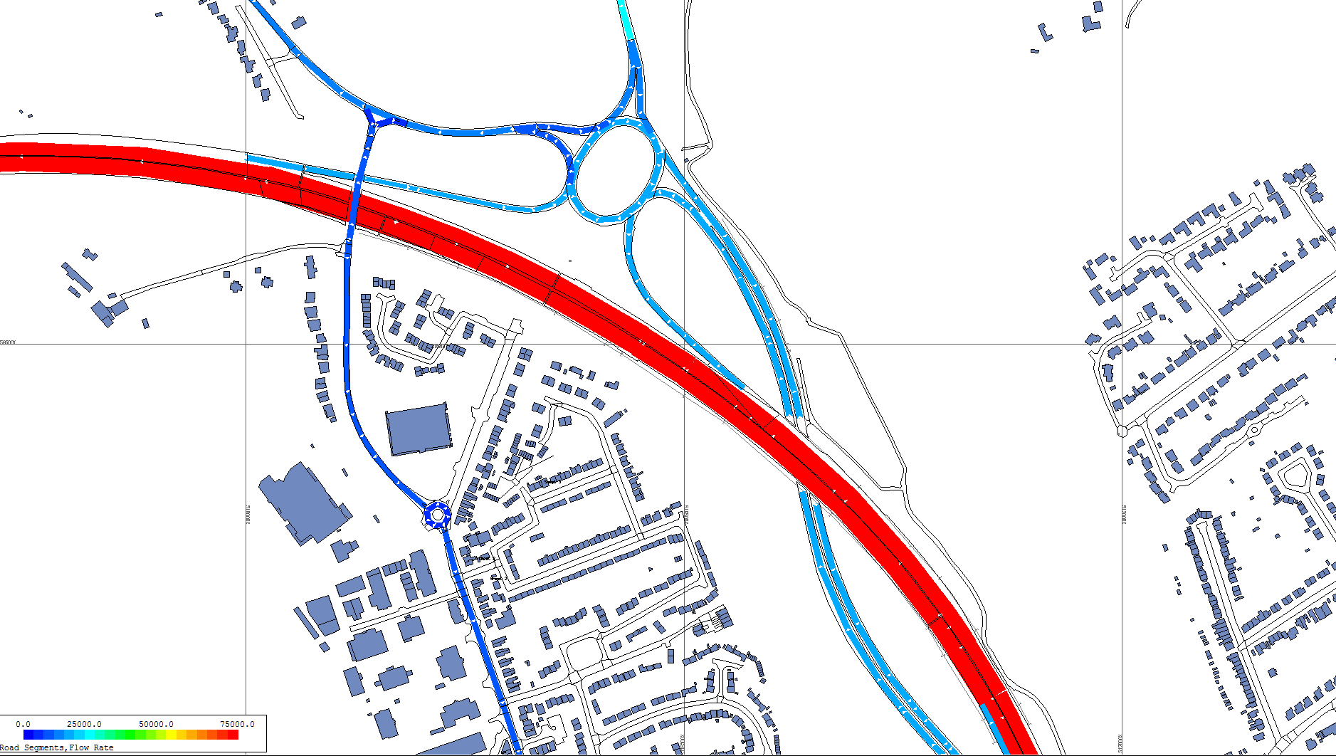
The view-as-colour tool can be used for checking the traffic flows assigned to the roads. In this example the main road has a high flow shown in red and the side roads with lower flows are shown in blue shades.
Traffic Speeds
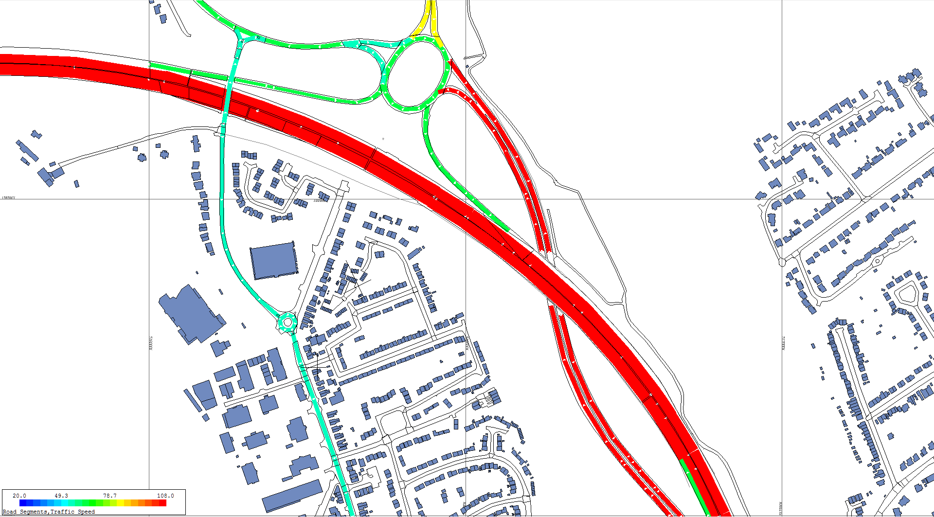
Another common example is looking at traffic speeds, the thematic viewing makes it very easy to see at a glance whether any errors have crept in from the input data.
Gradient Check
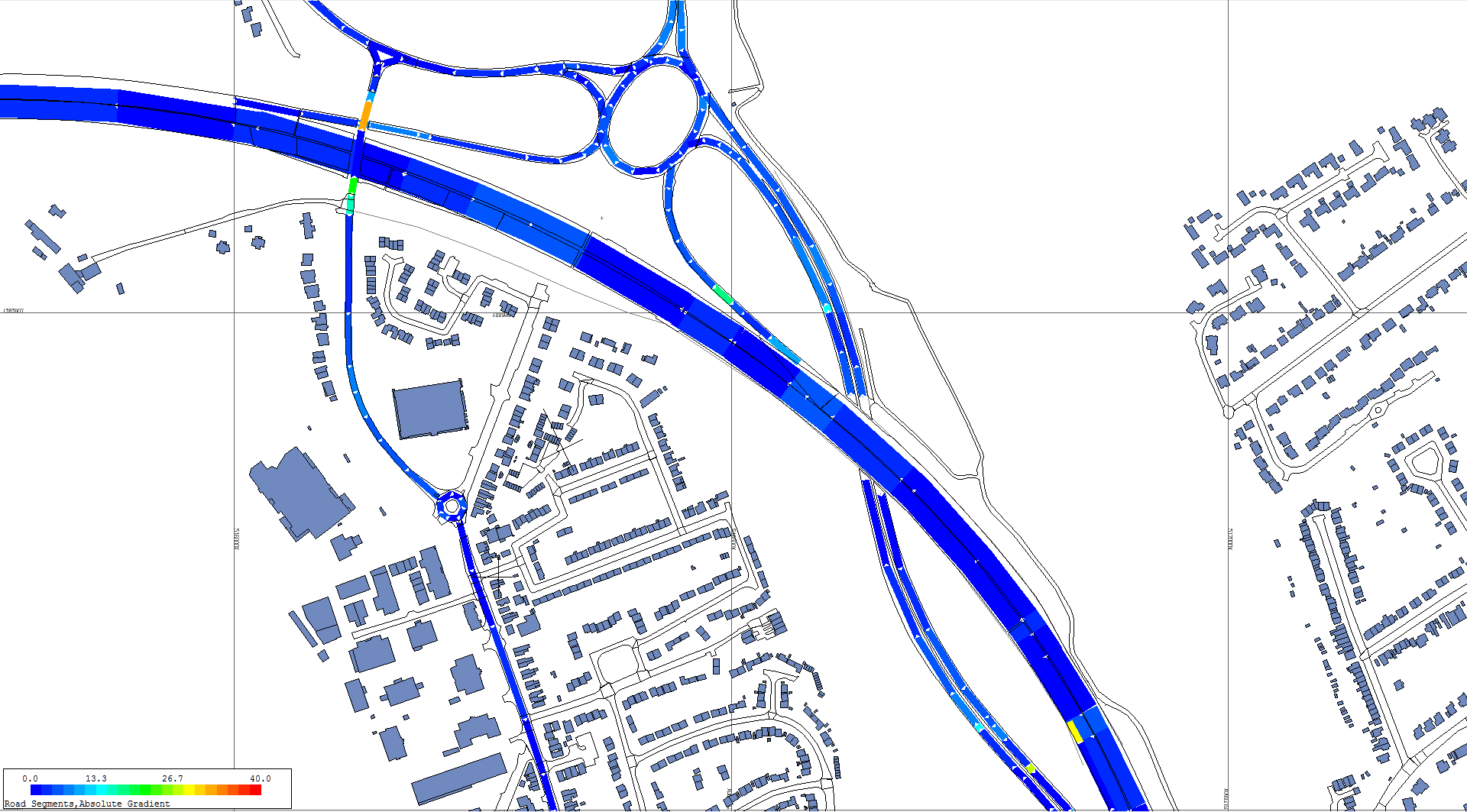
This diagram shows how the gradients of the roads vary along their length. Gradients are very modest on most new roads, and normally below 10 %. However, in this illustration there are a few short segments with a much higher gradient. This is indicative of errors in their start and/or end heights, perhaps due to ‘draping’ the road over an existing ground model. Such errors can be quickly spotted and eliminated.
Carriageway Type
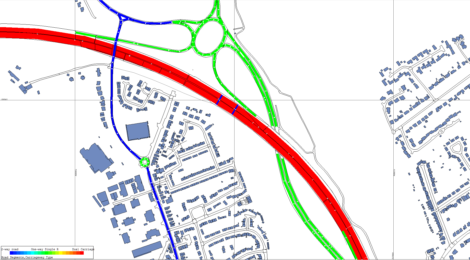
For many calculations, it is necessary to assign carriageway types such as normal two-way road, single carriageway and dual carriageway. This viewing tool makes it easy to check for errors in the process.
Construction Sites
- Activities

In the above diagram, the working locations are coloured according to the number of activities taking place. This not only shows where most of the work is occurring, but lets you see if any have been omitted.
- Categories

The above diagram shows the Category of activity – this could be the type of activity such as excavation, installation of plant, concreting or re-instatement.
- Contribution of noise
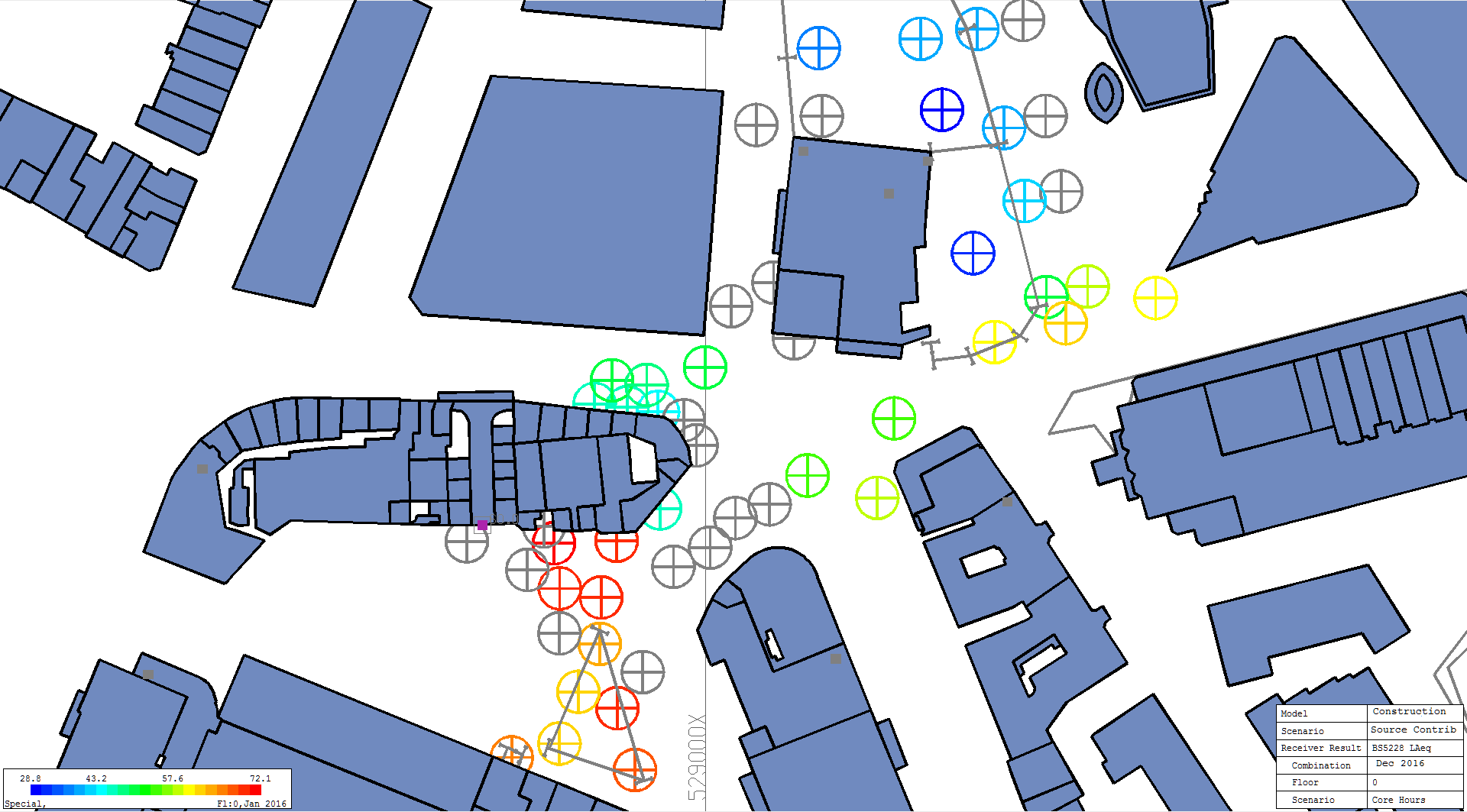
Above, you can see which source is causing most of the noise affecting a particular receiver point. Those coloured red are the predominant noise sources: those coloured grey are not being used in the current scenario. This visualisation is very useful when designing mitigation.
A big advantage of the NoiseMap approach is that you can see all the values of all the parameters that affect the noise level at any location. These can be output to a spreadsheet for detailed analysis.
Railway Noise
Railway noise visualisation tools are very similar to the Site Noise tools shown above.
This page just gives a taste of the full visualisation tool set.